Getting started and set up with packages and retrieving dataset.
#Installing required packages ("dslabs", "tidyverse")options(repos =c(CRAN ="https://cran.rstudio.com/")) #Attempting to address issue with downloading dslabs script at renderinstall.packages("dslabs") #for dataset
Installing package into 'C:/Users/shaun/AppData/Local/R/win-library/4.4'
(as 'lib' is unspecified)
package 'dslabs' successfully unpacked and MD5 sums checked

The downloaded binary packages are in
    C:\Users\shaun\AppData\Local\Temp\Rtmp0sfl5M\downloaded_packages
install.packages("tidyverse") #for tools for analysis
Installing package into 'C:/Users/shaun/AppData/Local/R/win-library/4.4'
(as 'lib' is unspecified)
package 'tidyverse' successfully unpacked and MD5 sums checked

The downloaded binary packages are in
    C:\Users\shaun\AppData\Local\Temp\Rtmp0sfl5M\downloaded_packages
── Conflicts ────────────────────────────────────────── tidyverse_conflicts() ──
✖ dplyr::filter() masks stats::filter()
✖ dplyr::lag()    masks stats::lag()
ℹ Use the conflicted package (<http://conflicted.r-lib.org/>) to force all conflicts to become errors
library("ggplot2") #for generated plots
#Getting an overview of the data
#Look at the gapminder data help file help(gapminder)
#Get an overview of the gapminder data structurestr(gapminder)
'data.frame':   10545 obs. of  9 variables:
 $ country         : Factor w/ 185 levels "Albania","Algeria",..: 1 2 3 4 5 6 7 8 9 10 ...
 $ year            : int  1960 1960 1960 1960 1960 1960 1960 1960 1960 1960 ...
 $ infant_mortality: num  115.4 148.2 208 NA 59.9 ...
 $ life_expectancy : num  62.9 47.5 36 63 65.4 ...
 $ fertility       : num  6.19 7.65 7.32 4.43 3.11 4.55 4.82 3.45 2.7 5.57 ...
 $ population      : num  1636054 11124892 5270844 54681 20619075 ...
 $ gdp             : num  NA 1.38e+10 NA NA 1.08e+11 ...
 $ continent       : Factor w/ 5 levels "Africa","Americas",..: 4 1 1 2 2 3 2 5 4 3 ...
 $ region          : Factor w/ 22 levels "Australia and New Zealand",..: 19 11 10 2 15 21 2 1 22 21 ...
#Get a summary of the gapminder datasummary(gapminder)
                country           year      infant_mortality life_expectancy
 Albania            :   57   Min.   :1960   Min.   :  1.50   Min.   :13.20
 Algeria            :   57   1st Qu.:1974   1st Qu.: 16.00   1st Qu.:57.50
 Angola             :   57   Median :1988   Median : 41.50   Median :67.54
 Antigua and Barbuda:   57   Mean   :1988   Mean   : 55.31   Mean   :64.81
 Argentina          :   57   3rd Qu.:2002   3rd Qu.: 85.10   3rd Qu.:73.00
 Armenia            :   57   Max.   :2016   Max.   :276.90   Max.   :83.90
 (Other)            :10203                  NA's   :1453
   fertility       population             gdp               continent
 Min.   :0.840   Min.   :3.124e+04   Min.   :4.040e+07   Africa  :2907
 1st Qu.:2.200   1st Qu.:1.333e+06   1st Qu.:1.846e+09   Americas:2052
 Median :3.750   Median :5.009e+06   Median :7.794e+09   Asia    :2679
 Mean   :4.084   Mean   :2.701e+07   Mean   :1.480e+11   Europe  :2223
 3rd Qu.:6.000   3rd Qu.:1.523e+07   3rd Qu.:5.540e+10   Oceania : 684
 Max.   :9.220   Max.   :1.376e+09   Max.   :1.174e+13
 NA's   :187     NA's   :185         NA's   :2972
             region
 Western Asia   :1026
 Eastern Africa : 912
 Western Africa : 912
 Caribbean      : 741
 South America  : 684
 Southern Europe: 684
 (Other)        :5586
#Determine the type of the object gapminder
class(gapminder)
#Getting started with data processing
#Filter out data from African countries by filtering by continent
#Filter out African dataafricadata <- gapminder |>filter(continent =="Africa")#View the newly filtered dataView(africadata)
#From the filtered Africa data, create two new objects, one with the two columns “infant_mortality” and “life_expectancy”, and second object with the two columns “population” and “life_expectancy”.
#Creating the first object named “africa_1” and looking at the overview and summary of the newly created object
#Using the "select" function to select the columns from the previous "africadata" datasetafrica_1 <- africadata |>select(infant_mortality, life_expectancy)#get an overview of the new africa_1 datsetstr(africa_1)
'data.frame':   2907 obs. of  2 variables:
 $ infant_mortality: num  148 208 187 116 161 ...
 $ life_expectancy : num  47.5 36 38.3 50.3 35.2 ...
#see a summary of the new africa_1 datasetsummary(africa_1)
 infant_mortality life_expectancy
 Min.   : 11.40   Min.   :13.20
 1st Qu.: 62.20   1st Qu.:48.23
 Median : 93.40   Median :53.98
 Mean   : 95.12   Mean   :54.38
 3rd Qu.:124.70   3rd Qu.:60.10
 Max.   :237.40   Max.   :77.60
 NA's   :226
#View the resulting object more closelyview(africa_1)
#Creating the second object named “africa_2” with the columns “population” and “life_expectancy” following the same approach as before
#Using the "select" function to select the columns from the previous "africadata" datasetafrica_2 <- africadata |>select(population, life_expectancy)#get an overview of the new africa_1 datsetstr(africa_2)
'data.frame':   2907 obs. of  2 variables:
 $ population     : num  11124892 5270844 2431620 524029 4829291 ...
 $ life_expectancy: num  47.5 36 38.3 50.3 35.2 ...
#see a summary of the new africa_1 datasetsummary(africa_2)
   population        life_expectancy
 Min.   :    41538   Min.   :13.20
 1st Qu.:  1605232   1st Qu.:48.23
 Median :  5570982   Median :53.98
 Mean   : 12235961   Mean   :54.38
 3rd Qu.: 13888152   3rd Qu.:60.10
 Max.   :182201962   Max.   :77.60
 NA's   :51
#View the resulting object more closelyview(africa_2)
#Create two different plots to evaluate the data from the objects arica_1 and africa_2 using the ggplot2 package - previously loaded.
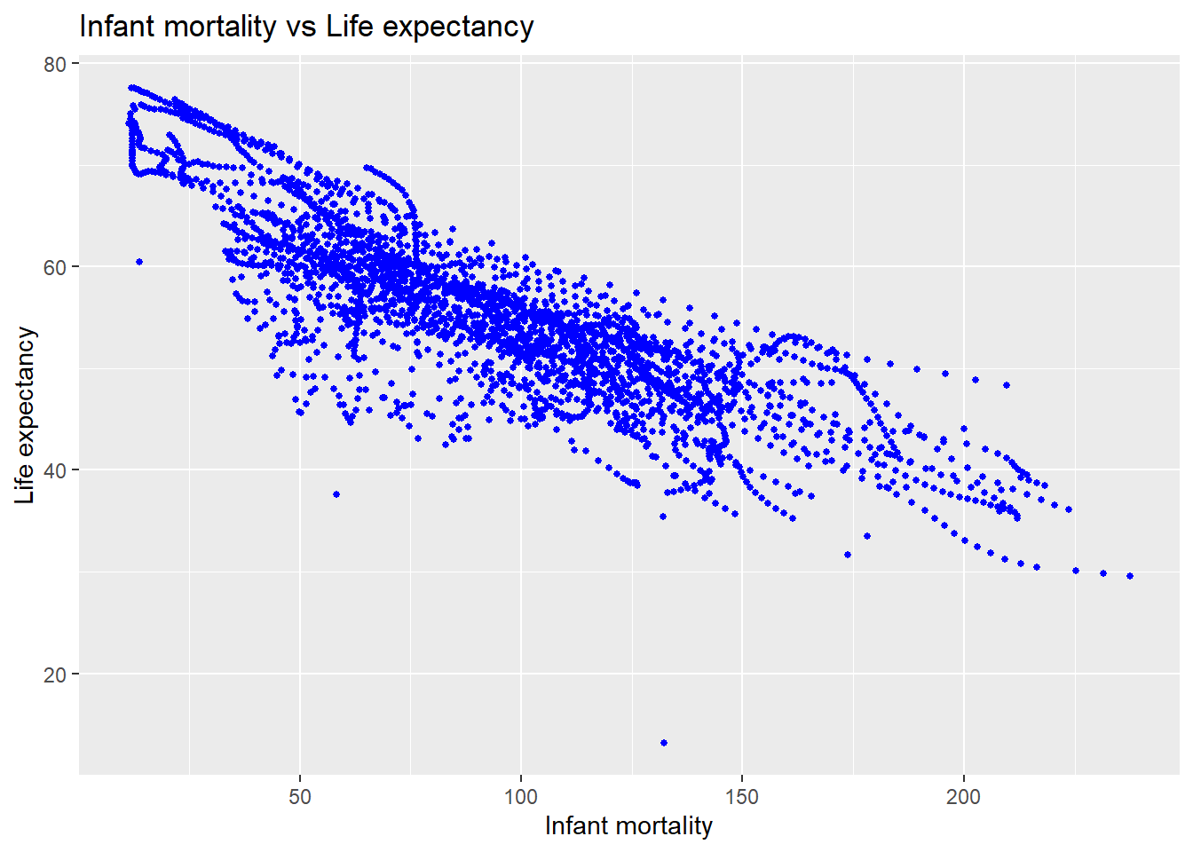
#Generate a plot demonstrating life expectancy as a function of infant mortality.
#Generate the plot as a scatter plot with the variables associated with the approiate axes, reduce point size to 1, set colour to blue, label different areas of the graphggplot(africa_1, aes(x = infant_mortality, y = life_expectancy)) +geom_point(size =1, color ="blue") +labs(title ="Infant mortality vs Life expectancy", x ="Infant mortality", y ="Life expectancy" )
Warning: Removed 226 rows containing missing values or values outside the scale range
(`geom_point()`).
#Save the generated plotggsave("africa_1_Life_expectancy_vs_infant_mortality.png", width =8, height =6)
Warning: Removed 226 rows containing missing values or values outside the scale range
(`geom_point()`).
The data shows shows a negative correlation between infant mortality and life expectancy. This is intuitive.
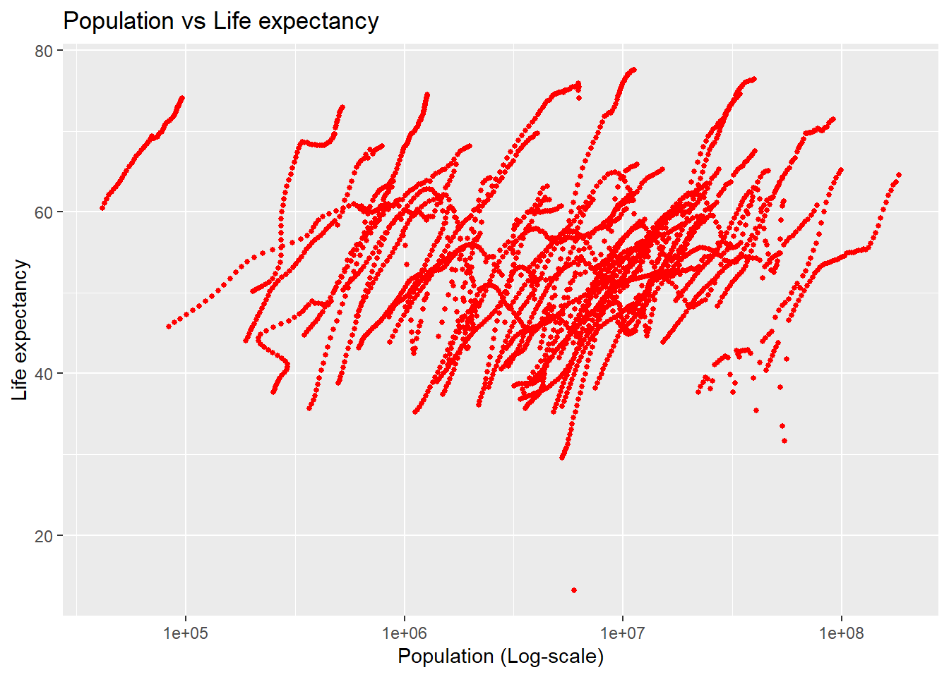
#Generate a second plot demonstrating life expectancy as a function of population size, where the x-axis (population) is plotted on a log scale
#Generate the plot as a scatter plot with the variables associated with the approiate axes,set the x-axis (population) to be in the log-scale, reduce point size to 1, set colour to red, label different areas of the graphggplot(africa_2, aes(x = population, y = life_expectancy)) +geom_point(size =1, color ="red") +scale_x_log10() +labs(title ="Population vs Life expectancy", x ="Population (Log-scale)", y ="Life expectancy" )
Warning: Removed 51 rows containing missing values or values outside the scale range
(`geom_point()`).
#Save the generated plotggsave("africa_2_Life_expectancy_vs_population_log_scale.png", width =8, height =6)
Warning: Removed 51 rows containing missing values or values outside the scale range
(`geom_point()`).
The plots generated are a bit messy and difficult to interpret as they currently are. The strange appearance is most likely a result of the repition of the data (collected data) that has occured by reporting the variables from 1962 to 2016. Therefore, there is a great deal of overlap and it is hard to see any real relationships or trends. This is amplified by the fact that the life expectancy and certainly the populaion changes each year and so the points are being shifted. It might be best to focus on a particular country or region over a period of time, or to focus on one particular year to reduce this overlap. T
#Search for years with missing (NA) data points for infant mortality.
#I used the textbook and ChatGPT to help me generate and correct my code. I tried the select function with & first which is not apprpriate for rowsmissing_infant_mortality <- africadata |>#Assigning new variable and searching in the datasetfilter(is.na(infant_mortality)) |>#continuing with pipe and filtering for where infant mortality is "NA"select(year) #continuing pipe and keeping the years where infant mortality is NA"
#Create a new object “africa_3_y2000” with the extracted data from the year 2000 from “africadata” and view the summary of the data
#Use the filter function to select the columns where the year is 2000africa_3_y2000 <- africadata |>filter(year==2000)#view the data structure of the new object africa_3_y2000str(africa_3_y2000)
'data.frame':   51 obs. of  9 variables:
 $ country         : Factor w/ 185 levels "Albania","Algeria",..: 2 3 18 22 26 27 29 31 32 33 ...
 $ year            : int  2000 2000 2000 2000 2000 2000 2000 2000 2000 2000 ...
 $ infant_mortality: num  33.9 128.3 89.3 52.4 96.2 ...
 $ life_expectancy : num  73.3 52.3 57.2 47.6 52.6 46.7 54.3 68.4 45.3 51.5 ...
 $ fertility       : num  2.51 6.84 5.98 3.41 6.59 7.06 5.62 3.7 5.45 7.35 ...
 $ population      : num  31183658 15058638 6949366 1736579 11607944 ...
 $ gdp             : num  5.48e+10 9.13e+09 2.25e+09 5.63e+09 2.61e+09 ...
 $ continent       : Factor w/ 5 levels "Africa","Americas",..: 1 1 1 1 1 1 1 1 1 1 ...
 $ region          : Factor w/ 22 levels "Australia and New Zealand",..: 11 10 20 17 20 5 10 20 10 10 ...
#view a summary of the new object africa_3_y2000summary(africa_3_y2000)
         country        year      infant_mortality life_expectancy
 Algeria     : 1   Min.   :2000   Min.   : 12.30   Min.   :37.60
 Angola      : 1   1st Qu.:2000   1st Qu.: 60.80   1st Qu.:51.75
 Benin       : 1   Median :2000   Median : 80.30   Median :54.30
 Botswana    : 1   Mean   :2000   Mean   : 78.93   Mean   :56.36
 Burkina Faso: 1   3rd Qu.:2000   3rd Qu.:103.30   3rd Qu.:60.00
 Burundi     : 1   Max.   :2000   Max.   :143.30   Max.   :75.00
 (Other)     :45
   fertility       population             gdp               continent
 Min.   :1.990   Min.   :    81154   Min.   :2.019e+08   Africa  :51
 1st Qu.:4.150   1st Qu.:  2304687   1st Qu.:1.274e+09   Americas: 0
 Median :5.550   Median :  8799165   Median :3.238e+09   Asia    : 0
 Mean   :5.156   Mean   : 15659800   Mean   :1.155e+10   Europe  : 0
 3rd Qu.:5.960   3rd Qu.: 17391242   3rd Qu.:8.654e+09   Oceania : 0
 Max.   :7.730   Max.   :122876723   Max.   :1.329e+11

                       region
 Eastern Africa           :16
 Western Africa           :16
 Middle Africa            : 8
 Northern Africa          : 6
 Southern Africa          : 5
 Australia and New Zealand: 0
 (Other)                  : 0
#Make new plots for the data from the year 2000 following the same approach and similar code as before
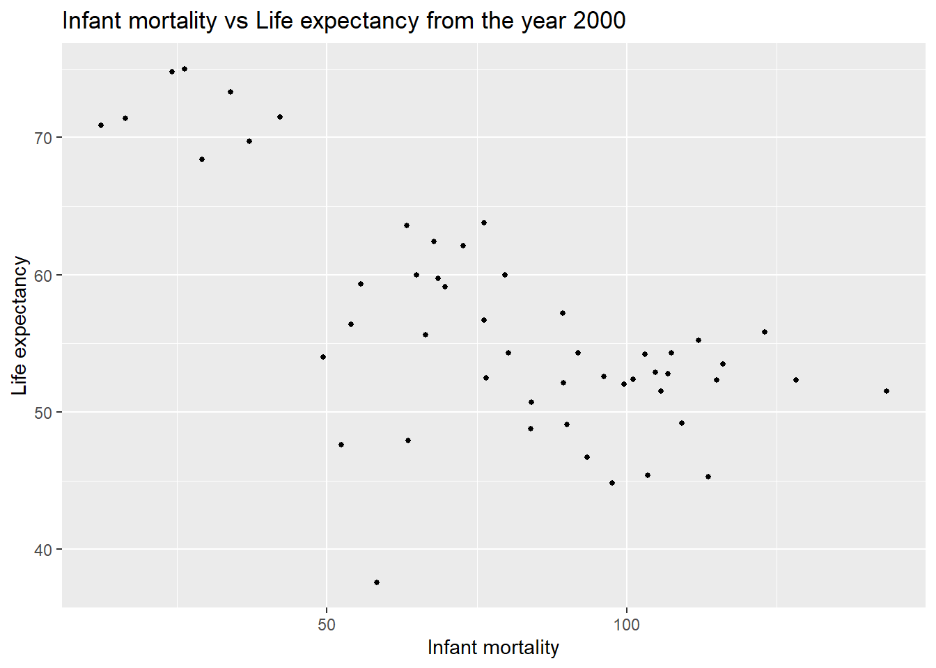
#Generate a plot to view infant mortality vs life expectancy from the year 2000 by using the filtered object created for the year 2000 from the Africa dataset that was originally created.
#Generate the plot as a scatter plot with the variables associated with the approiate axes, reduce point size to 1, set colour to black, label different areas of the graphggplot(africa_3_y2000, aes(x = infant_mortality, y = life_expectancy)) +geom_point(size =1, color ="black") +labs(title ="Infant mortality vs Life expectancy from the year 2000", x ="Infant mortality", y ="Life expectancy" )
#Save the generated plotggsave("africa_3_y2000_Life_expectancy_vs_infant_mortality.png", width =8, height =6)
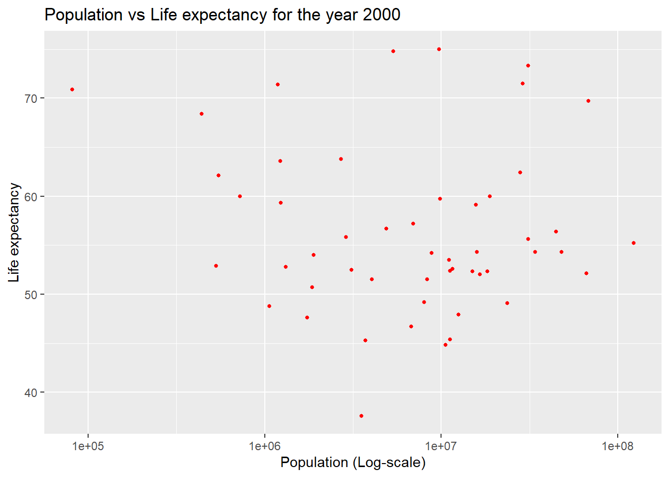
#Generate a simialr plot to view population (on a log-scale) vs life expectancy from the year 2000 by using the filtered object created for the year 2000 from the Africa dataset that was originally created.
#Generate the plot as a scatter plot with the variables associated with the approiate axes,set the x-axis (population) to be in the log-scale, reduce point size to 1, set colour to red, label different areas of the graphggplot(africa_3_y2000, aes(x = population, y = life_expectancy)) +geom_point(size =1, color ="red") +scale_x_log10() +labs(title ="Population vs Life expectancy for the year 2000", x ="Population (Log-scale)", y ="Life expectancy" )
#Save the generated plotggsave("africa_3_y2000_Life_expectancy_vs_population_log_scale.png", width =8, height =6)
#Fit a linear model to the data to help with further interpretation. Use the “lm” function to fit life expectancy as the outcome, with infant mortality as the predictor. This is based on the data from the year 2000 in Africa only.
fit1 <-lm(life_expectancy ~ infant_mortality, data = africa_3_y2000)#View the summary of the modelsummary(fit1)
Call:
lm(formula = life_expectancy ~ infant_mortality, data = africa_3_y2000)

Residuals:
     Min       1Q   Median       3Q      Max
-22.6651  -3.7087   0.9914   4.0408   8.6817

Coefficients:
                 Estimate Std. Error t value Pr(>|t|)
(Intercept)      71.29331    2.42611  29.386  < 2e-16 ***
infant_mortality -0.18916    0.02869  -6.594 2.83e-08 ***
---
Signif. codes:  0 '***' 0.001 '**' 0.01 '*' 0.05 '.' 0.1 ' ' 1

Residual standard error: 6.221 on 49 degrees of freedom
Multiple R-squared:  0.4701,    Adjusted R-squared:  0.4593
F-statistic: 43.48 on 1 and 49 DF,  p-value: 2.826e-08
From this fit it appears that infant moratlity has a strong and highly significant association with life expectancy (p value is 2.83e-08). We see that higher infant mortality is associated with a lower life expectancy.
#Generate a similar linear fit with life expectancy as the outcome and population size as the predictor. This is based on the data from the year 2000 in Africa only.
fit2 <-lm(life_expectancy ~ population, data = africa_3_y2000)#View the summary of the modelsummary(fit2)
Call:
lm(formula = life_expectancy ~ population, data = africa_3_y2000)

Residuals:
    Min      1Q  Median      3Q     Max
-18.429  -4.602  -2.568   3.800  18.802

Coefficients:
             Estimate Std. Error t value Pr(>|t|)
(Intercept) 5.593e+01  1.468e+00  38.097   <2e-16 ***
population  2.756e-08  5.459e-08   0.505    0.616
---
Signif. codes:  0 '***' 0.001 '**' 0.01 '*' 0.05 '.' 0.1 ' ' 1

Residual standard error: 8.524 on 49 degrees of freedom
Multiple R-squared:  0.005176,  Adjusted R-squared:  -0.01513
F-statistic: 0.2549 on 1 and 49 DF,  p-value: 0.6159
There does not appear to be any statistical significance in the relationship between population size and life expectancy in this dataset modelled. The p-value was 0.6159, which is not significant. This indicates that population size is not an effective predictor of life expectancy in this dataset.
…………………………………………………………………………………….
This section contributed by Asmith Joseph
# Taking a look at the dslabs to identify which dataset I want to choose for the assignmentlibrary(dslabs)data(package ="dslabs")
# I chose us_contagious_diseases dataset# Loading the us_contagious_diseases datasetthe Datasetlibrary(dslabs)data("us_contagious_diseases")
#The dataset contains the following columns:#disease: The name of the disease (e.g., "Measles," "Polio").#state: The U.S. state where the data was recorded.#year: The year the data was reported.#weeks_reporting: The number of weeks during the year in which the state reported data.#count: The number of reported cases of the disease.#population: The population of the state in the respective year.#rate: The number of disease cases per 10,000 people
#Exploring the datasets to identify variables and so on
head(us_contagious_diseases)
      disease   state year weeks_reporting count population
1 Hepatitis A Alabama 1966              50   321    3345787
2 Hepatitis A Alabama 1967              49   291    3364130
3 Hepatitis A Alabama 1968              52   314    3386068
4 Hepatitis A Alabama 1969              49   380    3412450
5 Hepatitis A Alabama 1970              51   413    3444165
6 Hepatitis A Alabama 1971              51   378    3481798
#checking the structure
str(us_contagious_diseases)
# Exploring the summary
summary(us_contagious_diseases)
        disease            state            year      weeks_reporting
 Hepatitis A:2346   Alabama   :  315   Min.   :1928   Min.   : 0.00
 Measles    :3825   Alaska    :  315   1st Qu.:1950   1st Qu.:31.00
 Mumps      :1785   Arizona   :  315   Median :1975   Median :46.00
 Pertussis  :2856   Arkansas  :  315   Mean   :1971   Mean   :37.38
 Polio      :2091   California:  315   3rd Qu.:1990   3rd Qu.:50.00
 Rubella    :1887   Colorado  :  315   Max.   :2011   Max.   :52.00
 Smallpox   :1275   (Other)   :14175
     count          population
 Min.   :     0   Min.   :   86853
 1st Qu.:     7   1st Qu.: 1018755
 Median :    69   Median : 2749249
 Mean   :  1492   Mean   : 4107584
 3rd Qu.:   525   3rd Qu.: 4996229
 Max.   :132342   Max.   :37607525
                  NA's   :214
#Processing and cleaning the Data. First I am filtering out diseases with missing data, mostly focusing on one specific diseases, Measles. ### Data Processing I focus on measles data for this analysis. The dataset is cleaned to remove rows with missing values, and a new variable, `rate_per_100k`, is calculated to represent cases per 100,000 people.# filtering out the data for measlesmeasles <- us_contagious_diseases %>%filter(disease =="Measles") %>%drop_na() # Remove rows with missing values# Adding a column for the cases per 100,000 populationmeasles <- measles %>%mutate(rate_per_100k = (count / population) *100000)# Previewing the cleaned datasethead(measles)
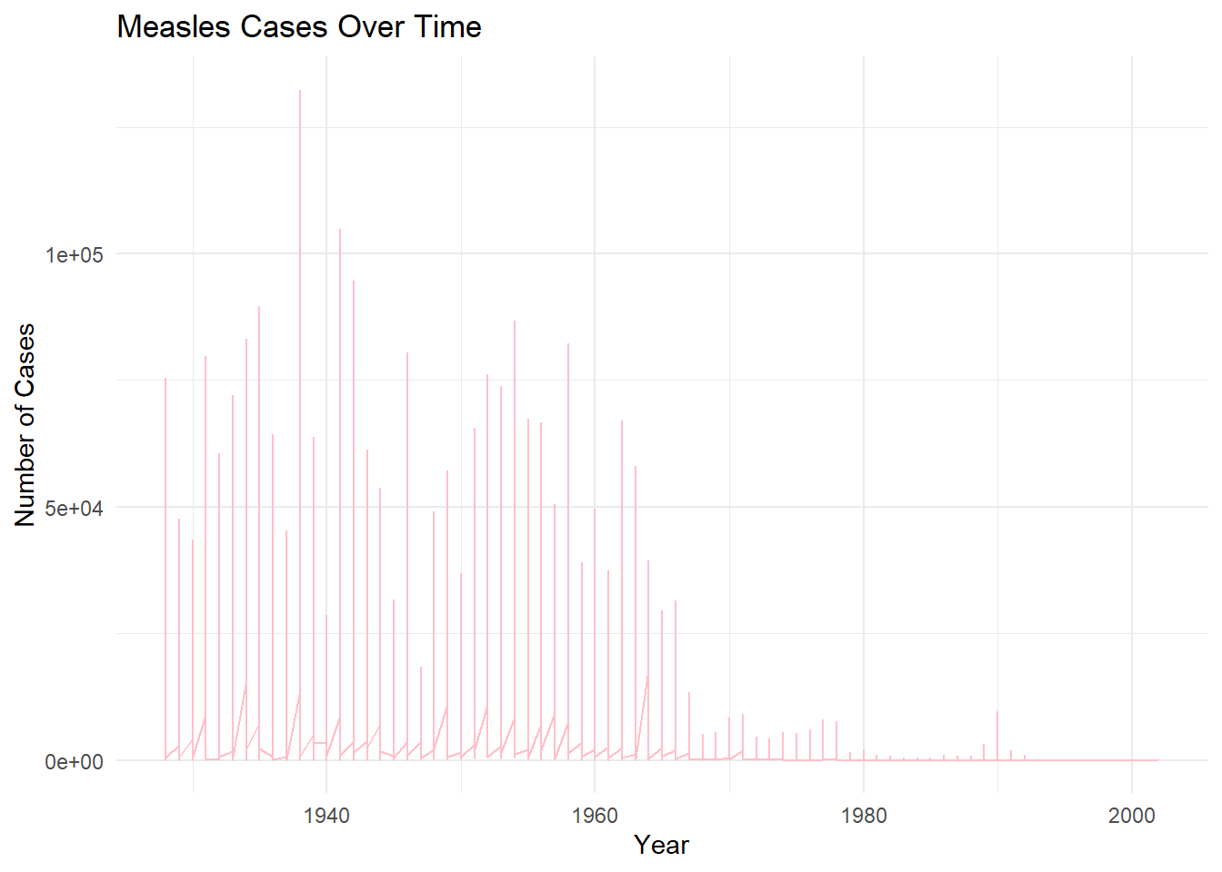
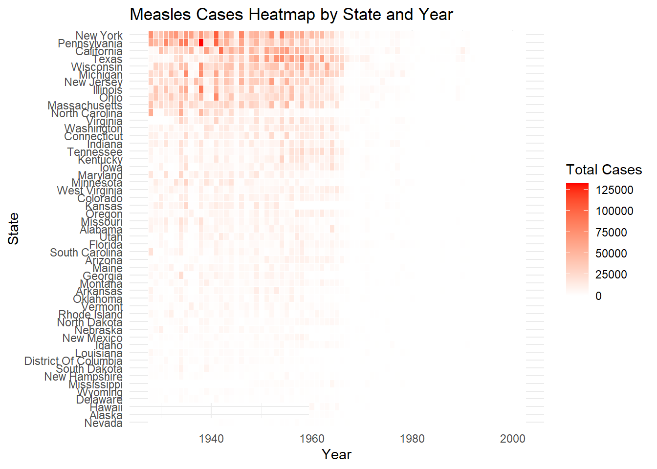
### In the next part, I am doing exploratory Figures by visualizing the trends of measles cases over time and across states. 1) figure shows the number of cases over the years, 2) second figure is a heatmap of cases by state and year.
#Creating exploratory figures, such as Visualize trends, distributions, or summaries.# Plot the total number of measles cases over timeggplot(measles, aes(x = year, y = count)) +geom_line(color ="pink") +labs(title ="Measles Cases Over Time",x ="Year",y ="Number of Cases") +theme_minimal()
# 2nd figure Measles Cases by State (Heatmap)# Creating a heatmap of cases by state and yearmeasles_heatmap <- measles %>%group_by(state, year) %>%summarize(total_cases =sum(count, na.rm =TRUE))
`summarise()` has grouped output by 'state'. You can override using the
`.groups` argument.
ggplot(measles_heatmap, aes(x = year, y =reorder(state, total_cases), fill = total_cases)) +geom_tile(color ="white") +scale_fill_gradient(low ="white", high ="red") +labs(title ="Measles Cases Heatmap by State and Year",x ="Year",y ="State",fill ="Total Cases") +theme_minimal()
Next Part, I am focusing on Statistical Model. fitting a simple linear regression model to examine the trend of measles cases over time. The model uses year as the predictor and count (number of cases) as the outcome variable.
# Fitting a linear model to examine the trend of measles cases over timemeasles_lm <-lm(count ~ year, data = measles)# Summarizing the modelsummary(measles_lm)
Call:
lm(formula = count ~ year, data = measles)

Residuals:
   Min     1Q Median     3Q    Max
-12080  -4342  -1783    846 122169

Coefficients:
              Estimate Std. Error t value Pr(>|t|)
(Intercept) 379731.549  15514.361   24.48   <2e-16 ***
year          -190.690      7.893  -24.16   <2e-16 ***
---
Signif. codes:  0 '***' 0.001 '**' 0.01 '*' 0.05 '.' 0.1 ' ' 1

Residual standard error: 10460 on 3759 degrees of freedom
Multiple R-squared:  0.1344,    Adjusted R-squared:  0.1342
F-statistic: 583.6 on 1 and 3759 DF,  p-value: < 2.2e-16
### Results from the Linear Model#The summary of the linear regression model shows the following:# 1) The slope coefficient for `year` is negative, indicating a decline in measles cases over time, 2) The model's p-value suggests that this decline is statistically significant.